Visual Design / UX Design
The Gender Equality Toolkit
Client
City Hub and Network for Gender Equity (CHANGE)
Our Role
Research, Testing, Lo/Hi Fidelity Design, Prototyping & Print
Duration
10 weeks from concept to completion
The Team
2 Designers: Jessy V. Castillo & Jenny Winjoy Lin
The Tools
Figma, Miro, Adobe Photoshop and Adobe Acrobat
About the Project
The City Hub and Network for Gender Equity (CHANGE) connects cities worldwide to share and implement effective gender equity practices. While they had compiled extensive research and policy frameworks, cities are often overwhelmed with documents and reports, and thus we needed a fresh approach.
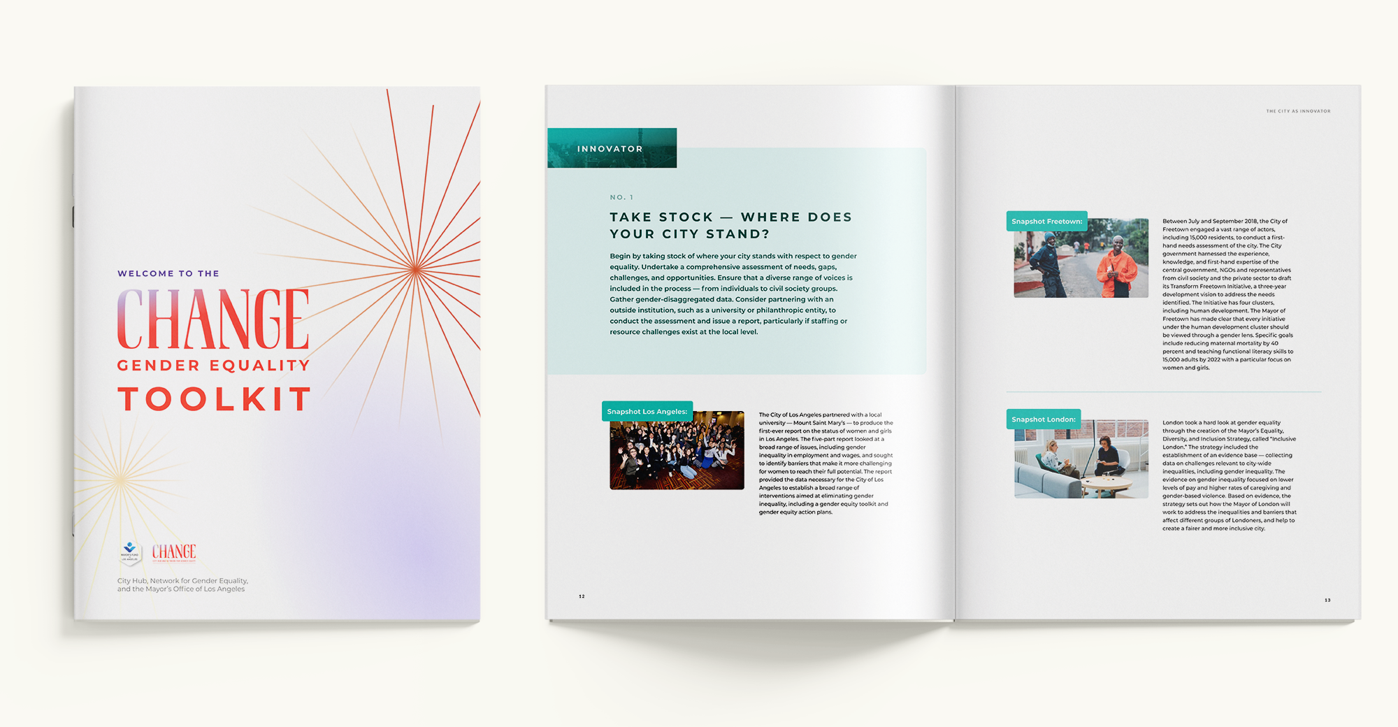
Our solution was to transform these insights into an intuitive digital experience. By designing an interactive toolkit and companion PDF, we created a resource that brings gender equity initiatives to life through real-world success stories and clear actionable steps. The toolkit organizes best practices across four key areas of local governance and includes features to enhance search-ability and internal navigation, allowing cities to easily find and adapt solutions to their specific needs.
As a designer on our two-person team, I co-developed a unified design system that made complex policy content feel modern and relevant, while ensuring a cohesive experience across both digital and print formats. Our approach turned what could have been another dense document into an engaging resource that captures cities' attention and guides action.
01 – Discovery
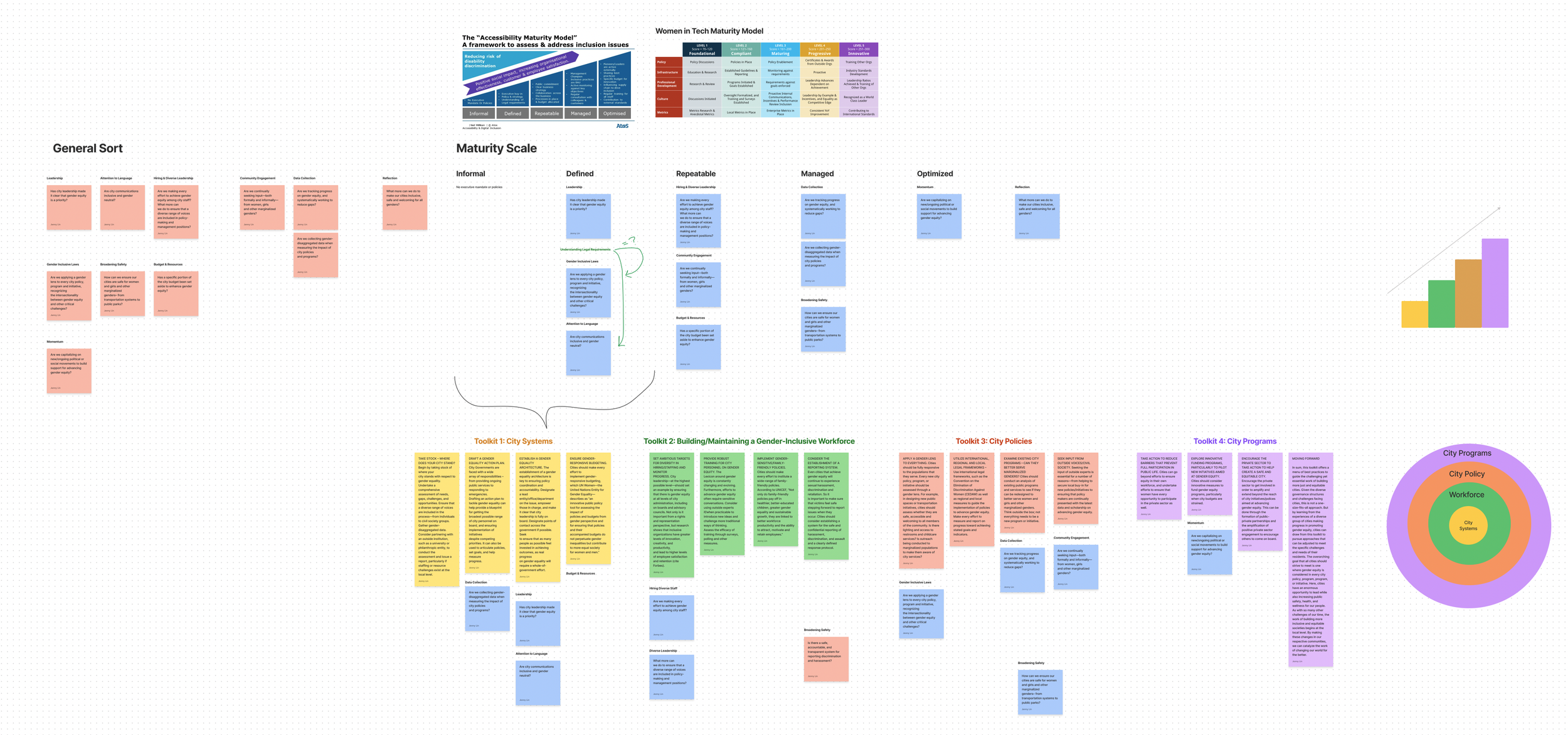
content audit
Before beginning the design process, we analyzed the report, assessed it in the context of similar reports and metrics in the government and non-profit sectors, and identified opportunities for creating a more digestible and actionable experience. Our main goal was to highlight existing strengths and weaknesses within the report and make informed decisions about the digital and printed presence of this product.
We structured the content around their maturity model, breaking down dense information into clear, progressive stages. Upon analyzing the results, we reinforced these stages by developing a color coding system to help users quickly understand their city's current position and potential paths forward. This approach transformed complex insights into an intuitive journey that cities could navigate and act upon.
key Design Goals
Efficiently guide users through the content with clear visual cues.
Recognizing that this report was intended to engage users into implementing change at the local and global level, we wanted to make the content and questions more visually engaging in both printed and digital products.
Ensure the report is accessible for multi-generational teams.
This would require a design that is accessible to those who are considered “native tech” users as well as those who developed relationships with tech later in life and are therefore less comfortable with online experiences.
User Context & Insights
Approach
To understand our user's frustration and pain points with reading and having actionable resources for change-making, we needed to see things from their perspective. We conducted additional research of similar reports that were celebrated in the community as well as interviews with stakeholders familiar with this landscape.
Process
Perform Online Audit
Schedule & Conduct Stakeholder Interviews
Review Notes
Conduct User Synthesis
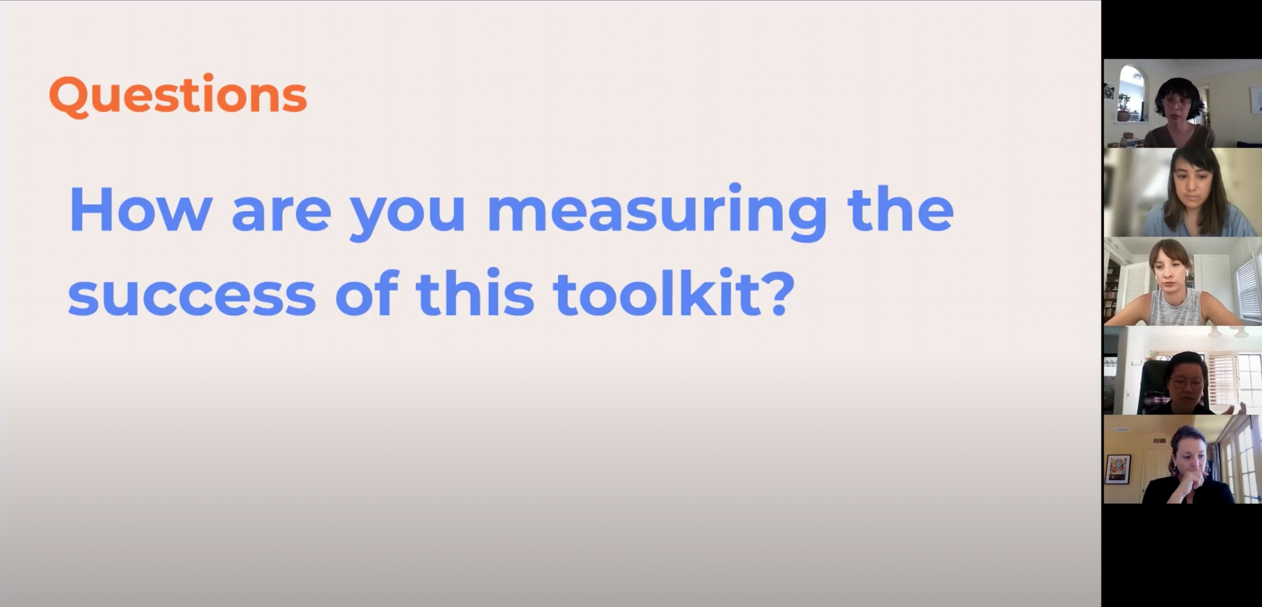
Stakeholder Questions
We interviewed 3 stakeholders on the CHANGE project to better understand common challenges and insights into the project’s identity and markers of success.
What words come up for you when you think of this Toolkit’s personality?
When reading reports, which information are you seeking to find first: action items, external resources, other?
How does our proposed interactions compare to other government reports you view and engage with?
Actionable Insights
Adapt Content
Redesign written content for digital engagement for user accessibility, and seamlessly adapt it to a print experience.
Expand Branding
Expand upon “CHANGE” brand guidelines for the Toolkit to offer a distinct perspective in a crowded market.
Foster Reflection
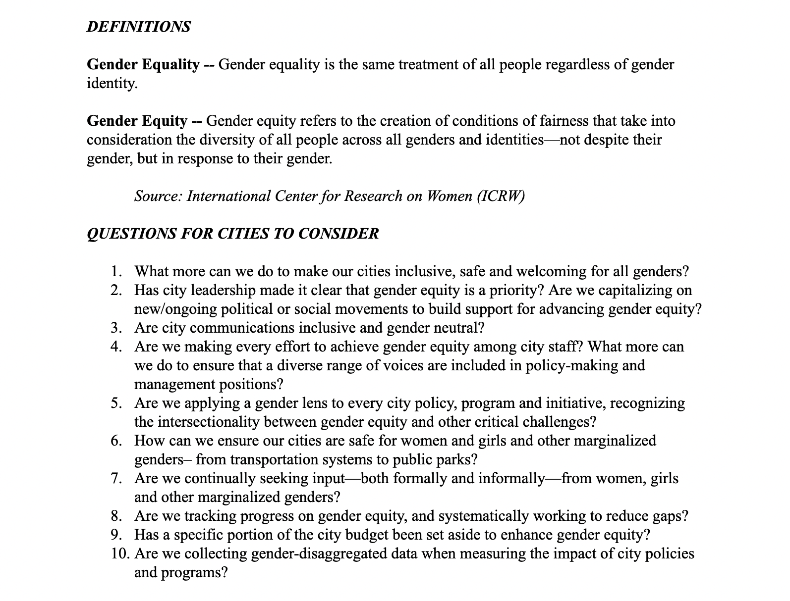
Identify opportunities for “reflection moments” throughout the toolkit, highlighting core questions and action items for users to take.
02 – Design
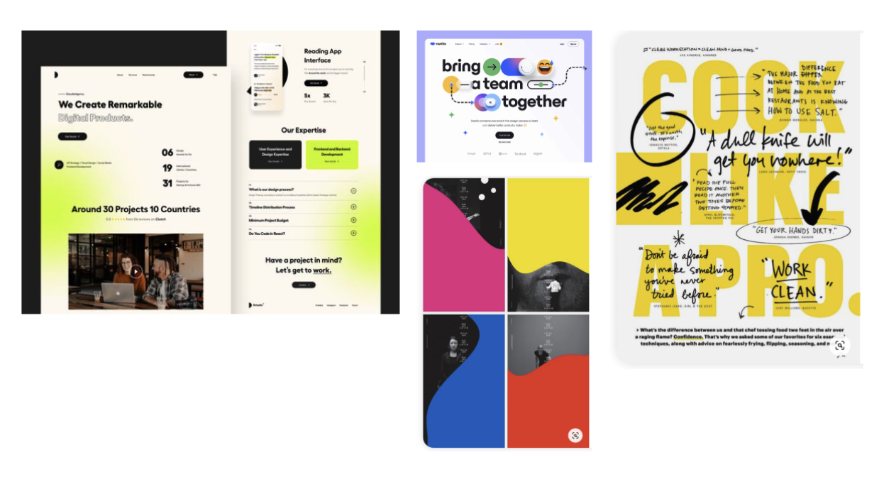
Moodboards
Friendly
Visual cues:
Simple, approachable language
Highlighted content and calls-to-action throughout
Illustrations or color blocks
Bold
Visual cues:
Bright saturated colors
Lots of contrast in color, size, and scale
Modern use of graphics, typography, and texture
Inviting
Visual cues:
Softer color palette
Wide arrange of colors, not monotonous
Playful use of illustrations and form
Visual Directions
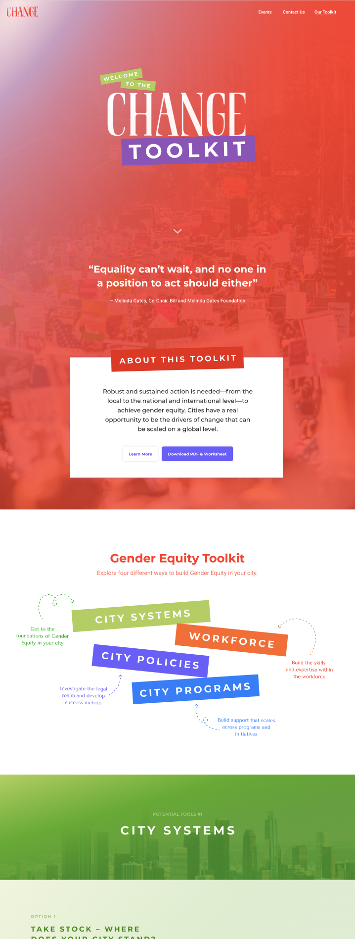
Friendly
Key elements:
Jewel-toned colors that compliment the original CHANGE identity while offering a unique visual take on a gender-focused report
Playful arrows and High-Contrast Boxed text to guide users
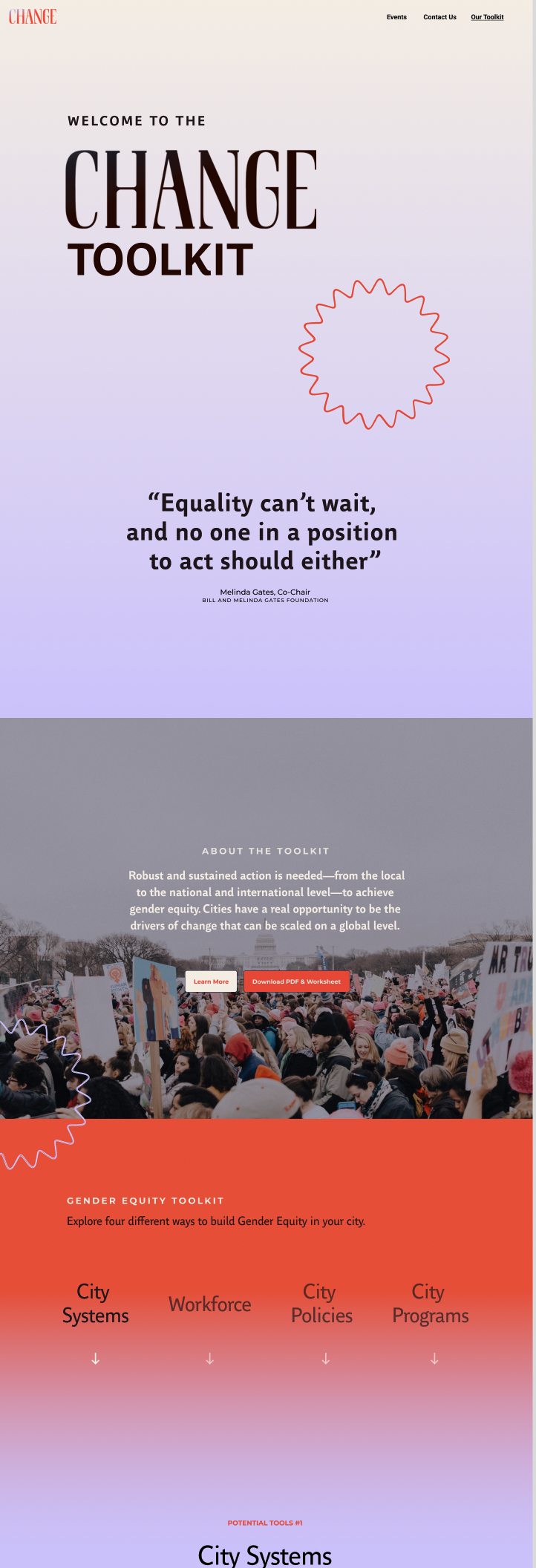
Bold
Key elements:
Introduction of Lavender color to the CHANGE palette, taking a more bold color treatment and brand-focused approach.
Minimal layout, graphics, and content spacing to allow for an easy reading and journalistic experience
Inviting
Key elements:
Intentional of illustrations featuring multi-generational and multi-racial figures to humanize the toolkit’s content
Clear use of section signifiers (corresponding illustration and color)
Prototypes
Engaging Quiz
Key elements:
Enhanced micro-interactions
Changed the Questions to a Quiz for more engagement
Landing page is Toolkit-intro forward
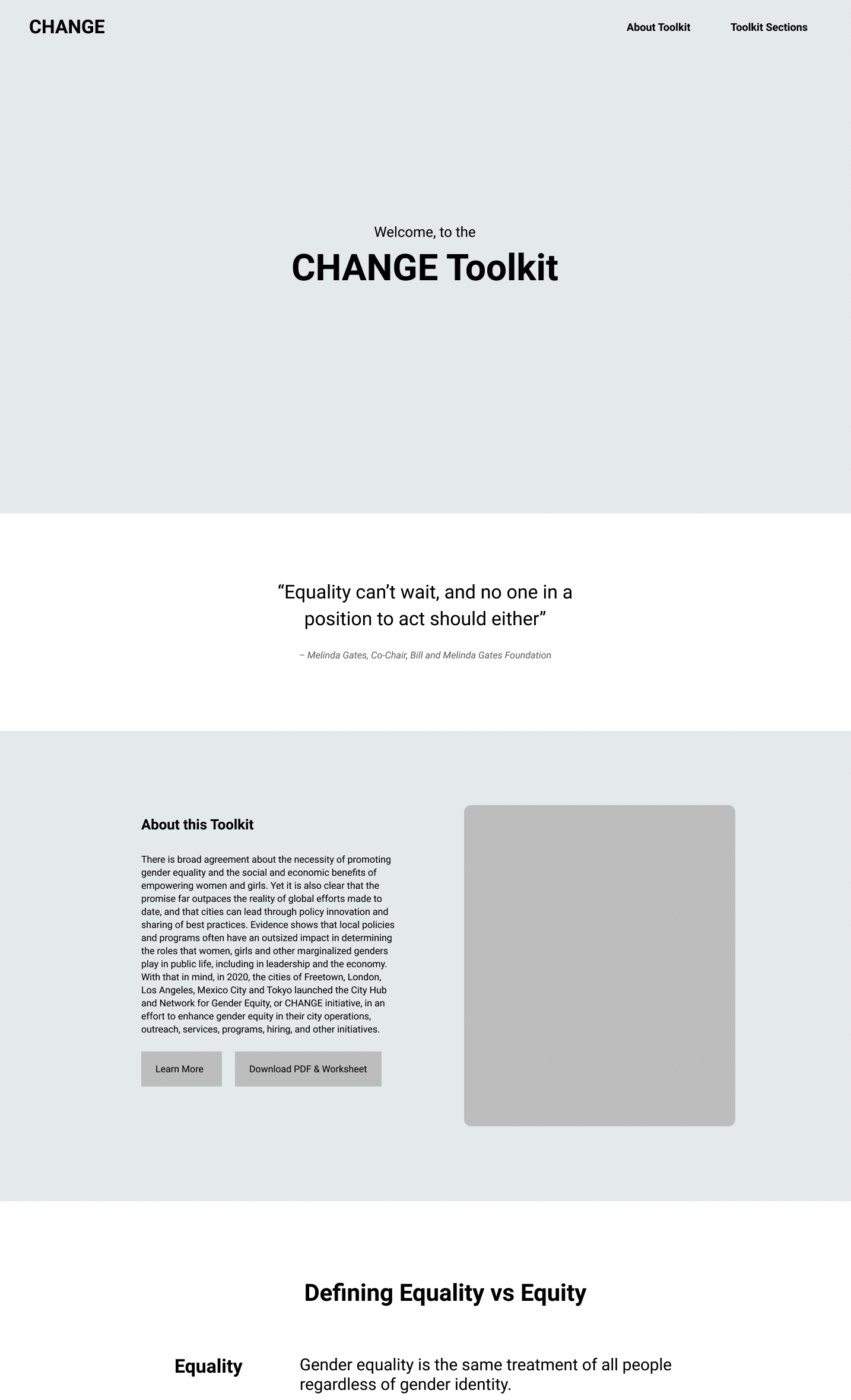
Simple Scroll
Key considerations:
Minimal One-Page
Questions are integrated throughout
Has sticky-scrolling elements
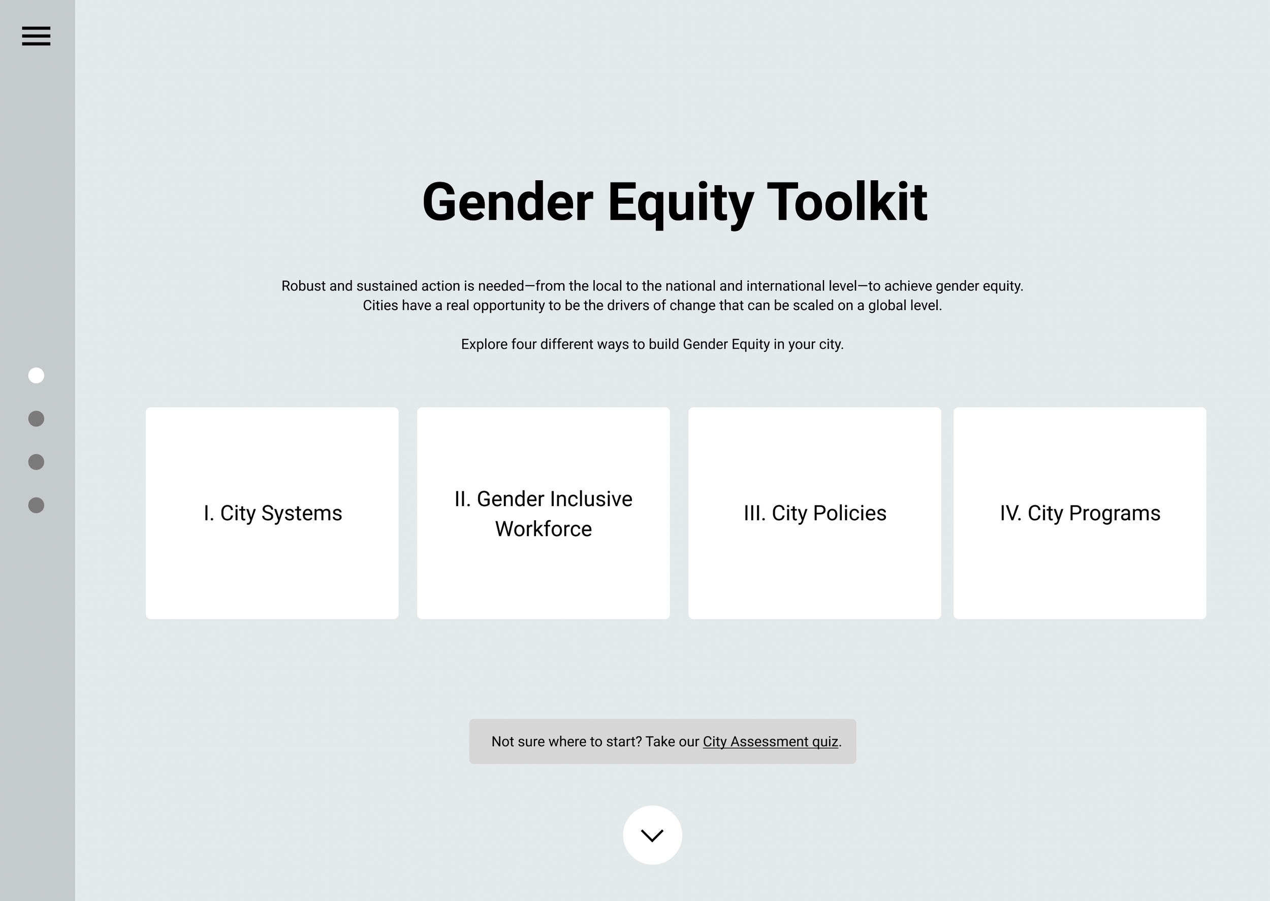
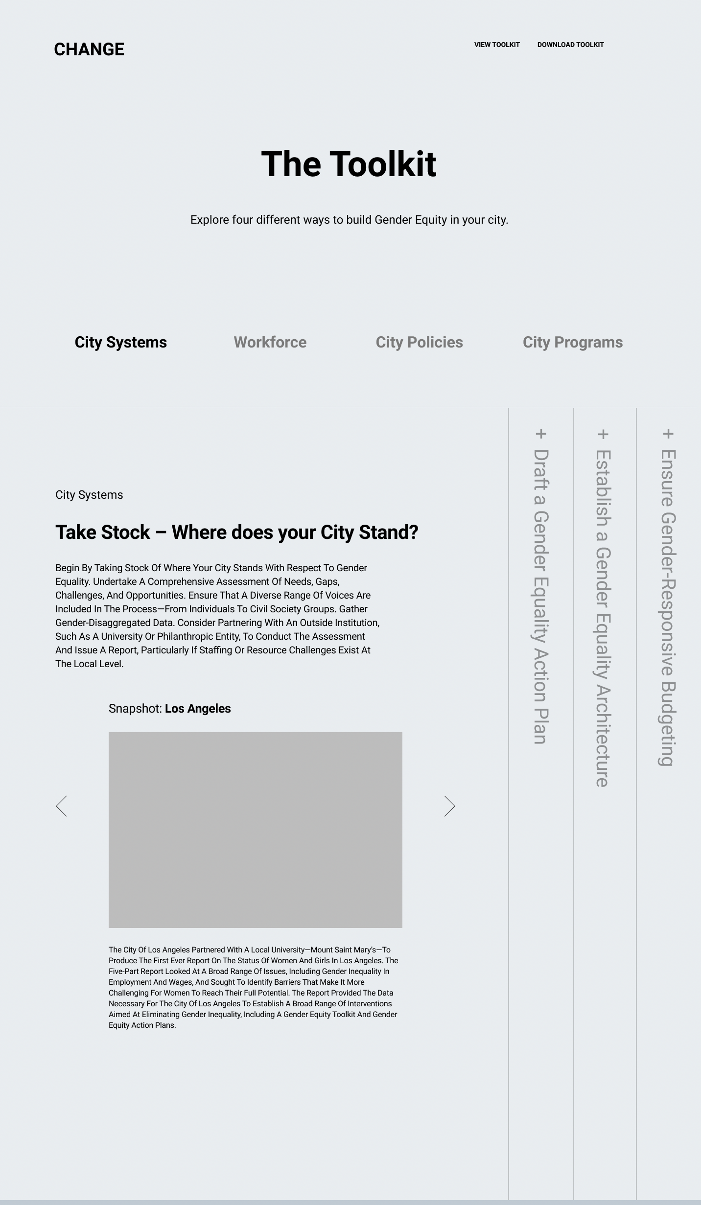
Interactive Sections
Key elements:
Two Page Build
Calls to Action are simplified and direct
Design encourages sectional micro-interactions
03 – Testing
usability testing
Approach
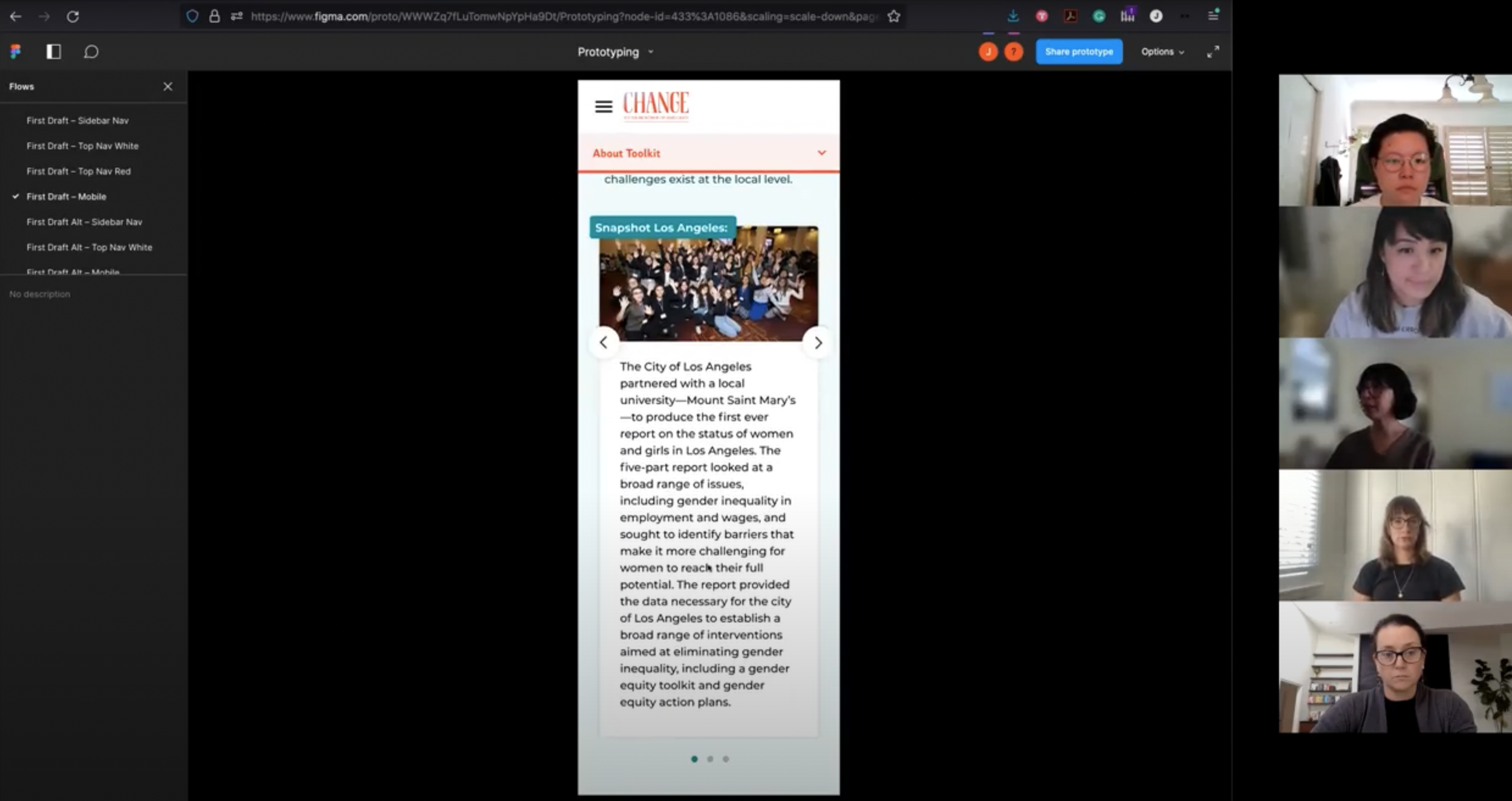
Upon confirming the visual and functionality approach of the toolkit, our team set forth on developing the high-fidelity product prototype for testing with the CHANGE stakeholder group (3 individuals, women-identifying, and working in the non-profit and government sectors). We created a desktop and mobile version, and invited stakeholders to review the product, gathering insights into usability, content navigation, color implementation and accessibility, and overall functionality.
Key Findings
The sidebar for desktop and white navigation bar for mobile were most accessible for the variety of audiences.
Though the expanded brand introduction of jewel tone options seemed appropriate, the report covers critical issues in global gender equity policies and thus must be minimal in design and “less playful” overall.
Written content and introductions required additional written context (such as introductions and hyperlinked footnotes) for the digital and printed products.
Since users are likely to seek out specific actions or content, content must be: searchable with accessibility tools, identifiable through color, and include jump-links to promote easy access.
Changes Made
01
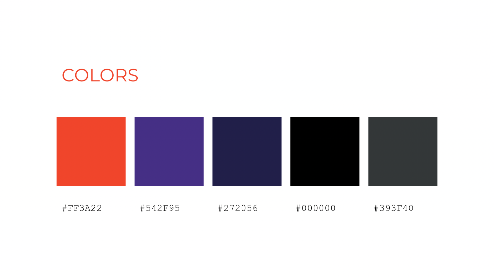
Expanded color palette that functions as a legend and compliments toolkit content, guiding users in both products as they move through the report.
02
Leverage the use of clearly identifiable tool tips, bold background gradients, and abstract celebratory shapes (such as starbursts) to engage readers.
03
Integrated “City Assessment” questions in a single-page scroll format, inviting users to meaningfully reflect on the content, sorted by similar content sections.
04 – Launch
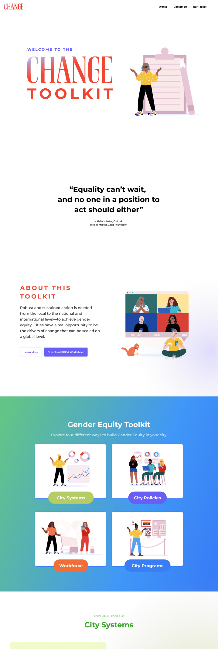
final designs – WEB
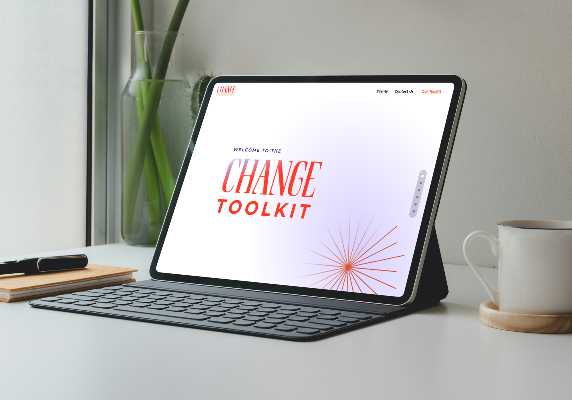
Desktop View (Left), Mobile View (Right)
final designs – print
Holly Millburn-Smith, CHANGE
“Jessy (of Rara Matter) was a wonderful partner to work with on our Gender Equality Toolkit. Creatively, they were engaged and responsive, skillfully bringing out a coherent design identity from our team’s varied input and, at times, ill-defined direction. They were knowledgeable about the topic, which wasn’t a requirement, but helped immensely in bringing our vision for the project to life. As a project manager, Jessy was organized, timely, and flexible, confirming details and keeping us within the bounds of our tight timeline. Overall, they were a pleasure to work with. I would recommend Jessy widely and be delighted to work with them again.”
outcomes & next steps
The final reports were delivered to CHANGE Network, with developer handoff notes included. The PDF versions of the report were presented globally in 2021 alongside partner cities such as Mexico City, Barcelona, Buenos Aires, and others. The PDF was widely shared on Twitter and LinkedIn, as was intended at the outset, and has been implemented into a variety of global gender equity programs.
Though we were challenged in the beginning with the content writing style and concept of presenting a unique gender equity call-to-action (without defaulting into historical feminist aesthetics), the community and stakeholders were not only receptive but also greatly supportive of the final product and overall work that CHANGE has been doing over the years.
Next Steps for CHANGE
Now that all designs for the digital and print products have been completed, CHANGE is in the process of securing a developer for the digital implementation of the report.


